logo-7
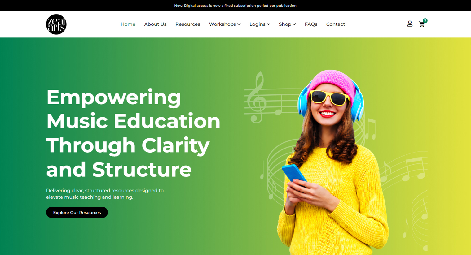
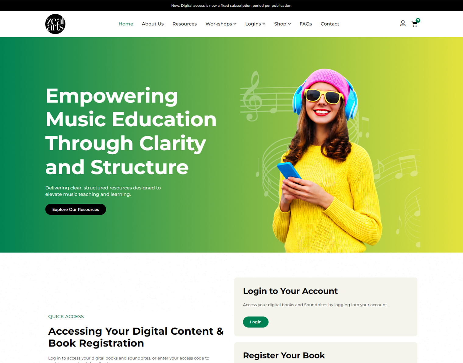
After Image
AFTER
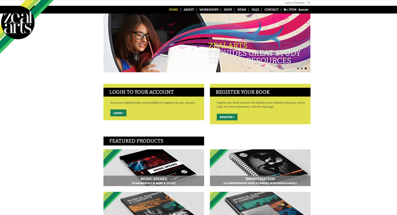
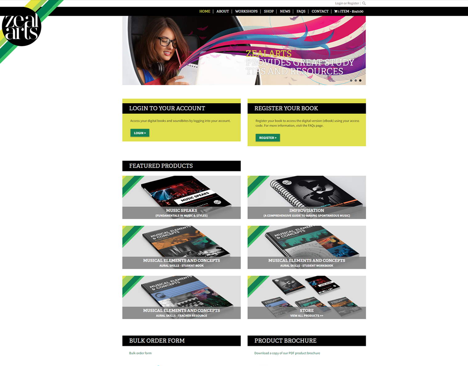
Before Image
BEFORE

Overview

ZealArts provides high-quality study titles and educational resources for music education, catering to students, teachers, and booksellers. To better serve its diverse community and modernize its online presence, the platform underwent a complete redesign on WordPress. The project focused on refining the overall visual identity, streamlining navigation, optimizing for mobile devices, and creating tailored entry points for distinct user groups.

The Challenge

The original ZealArts website suffered from a cluttered, outdated visual structure that hindered user engagement and navigation clarity. High-contrast, dark content blocks coupled with rigid, repetitive grid layouts created visual friction, while key user actions—such as account login, book registration, and resource browsing—were buried in dense blocks of text. Furthermore, the lack of clear categorization for different audience personas made it difficult for teachers, students, and booksellers to quickly locate their dedicated portals or relevant products.

Solution

UI/UX Design

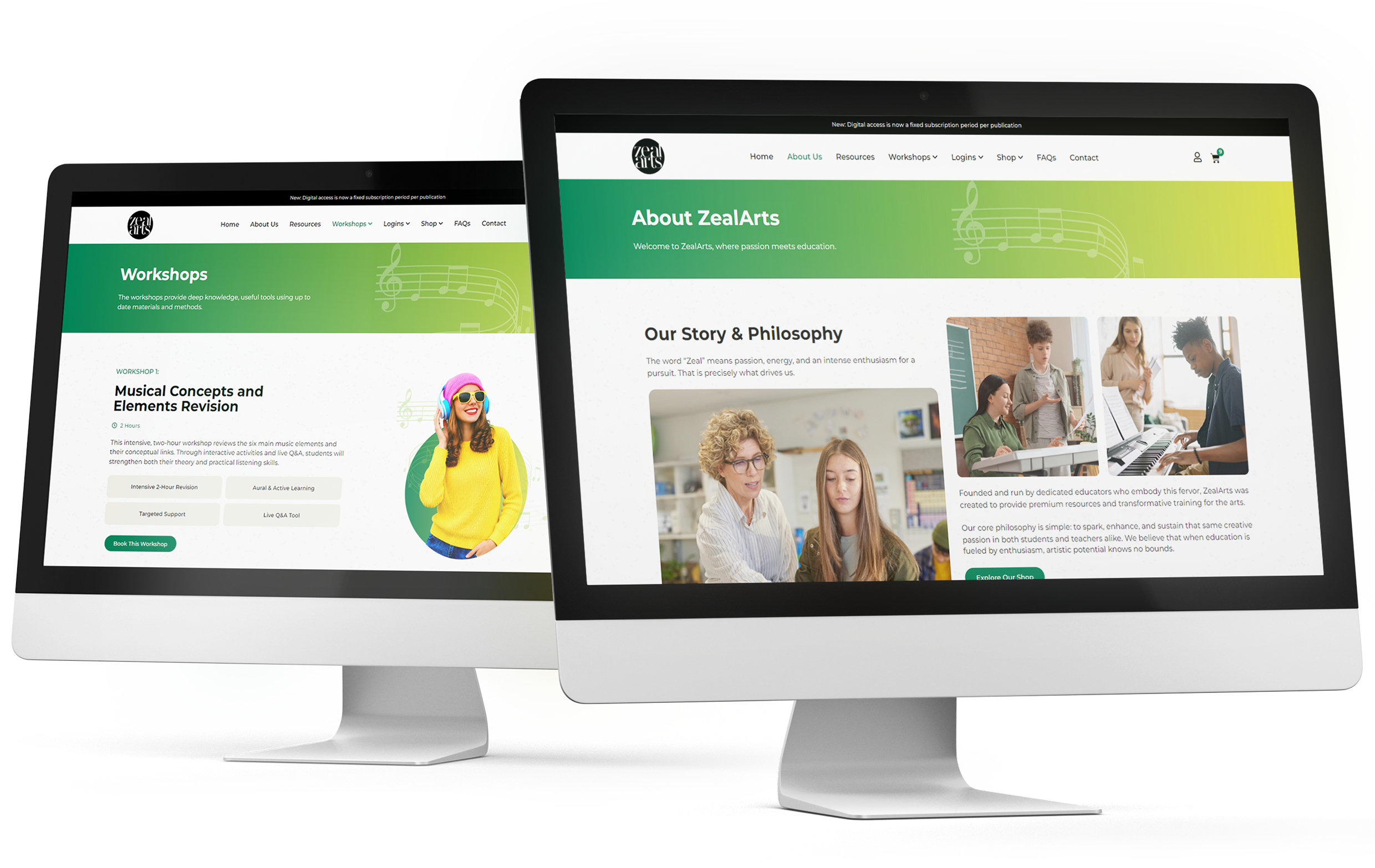
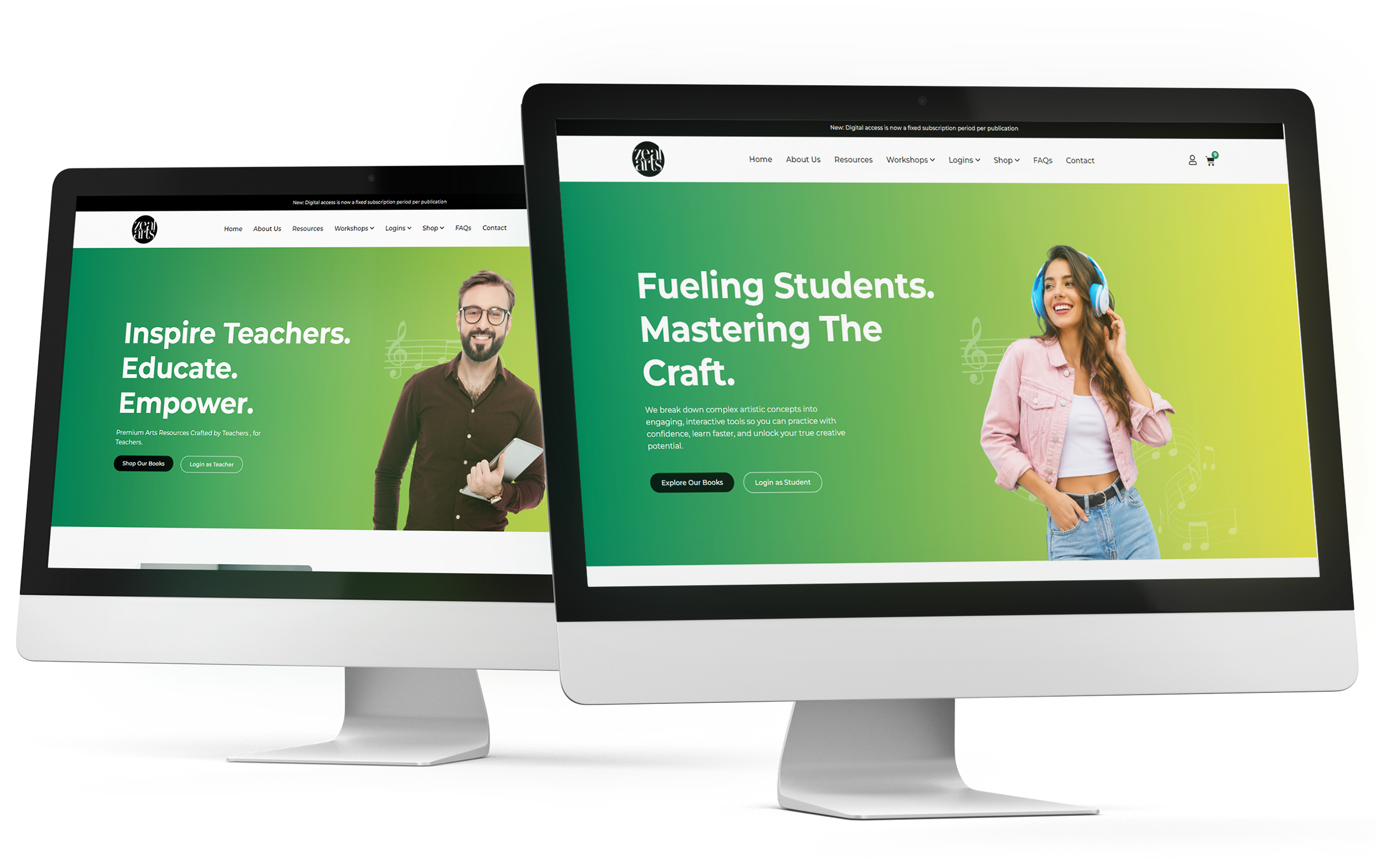
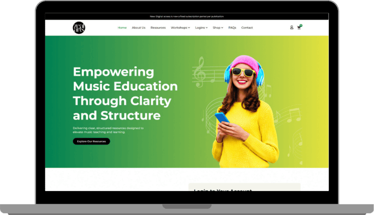
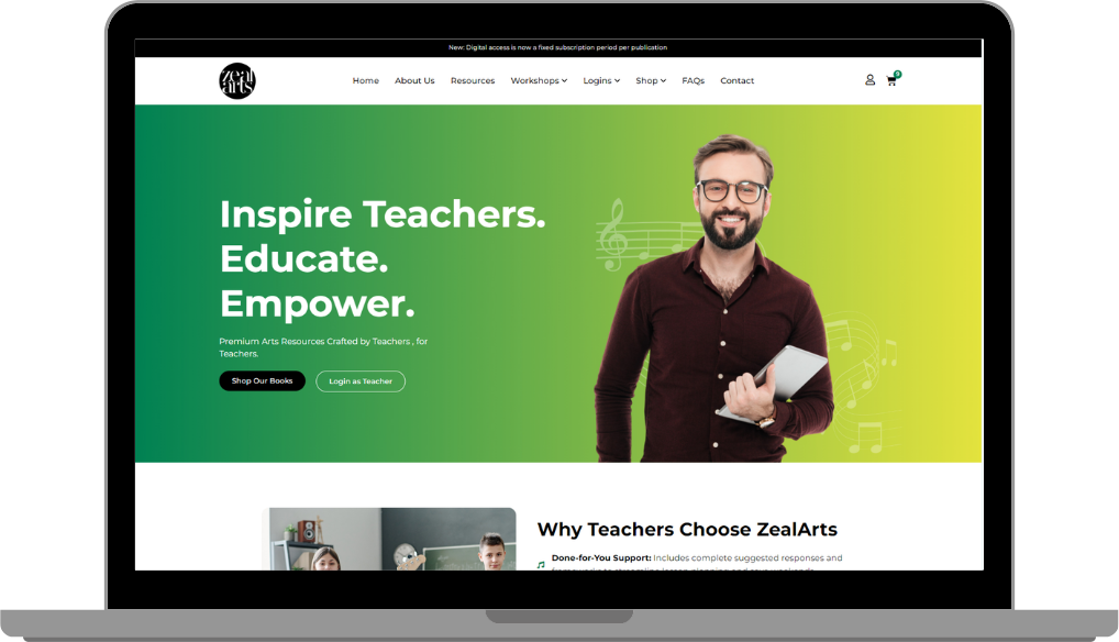
Redesigned the interface with a clean, modern aesthetic featuring generous whitespace, vibrant gradient hero banners, and clear visual hierarchy to guide users effortlessly through courses, products, and workshops.

UI-UX Design

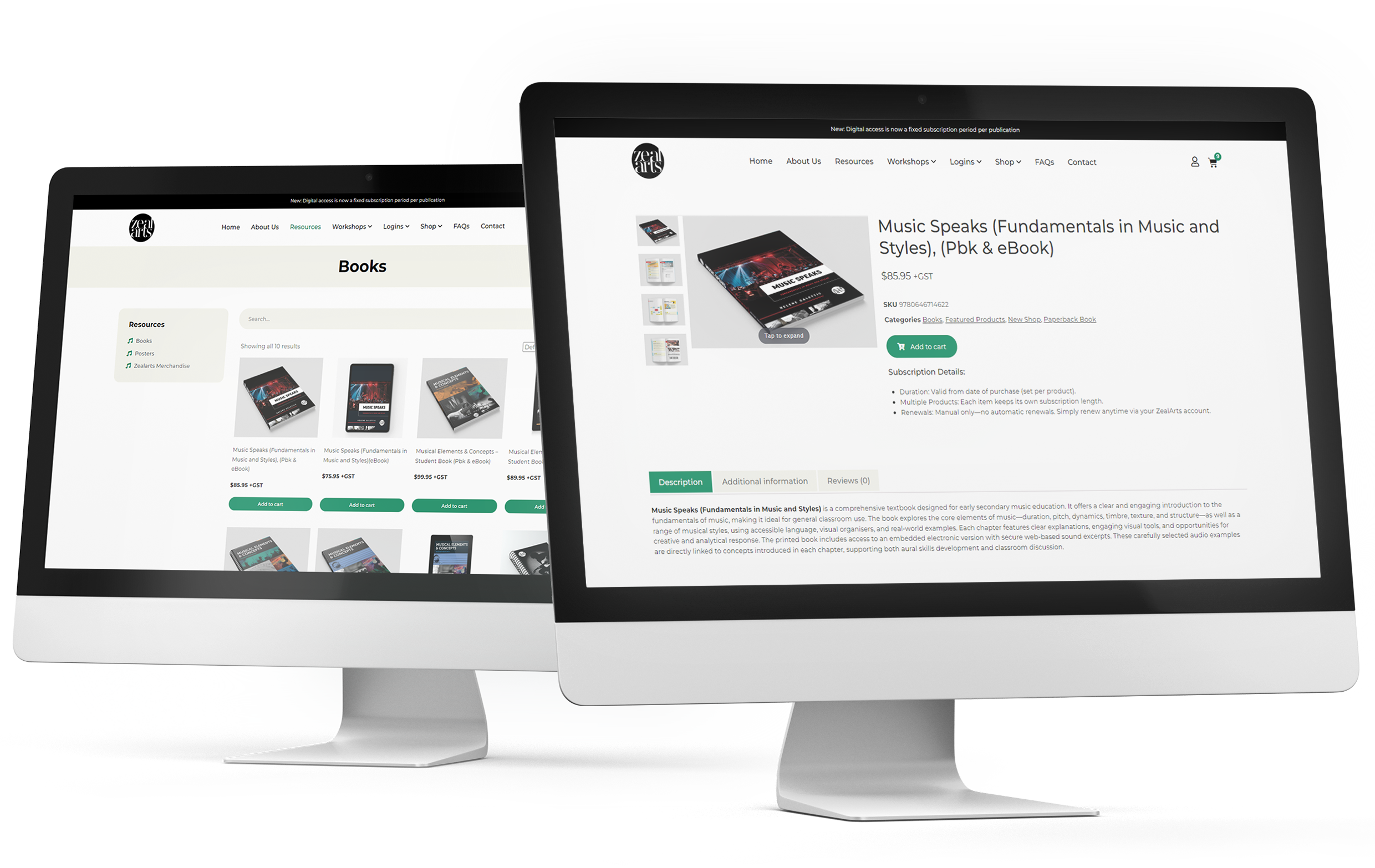
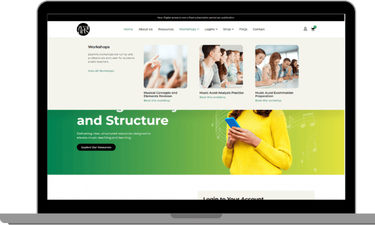
Implemented a structured mega menu navigation system that categorizes extensive resource libraries, store items, and informational pages into intuitive multi-column dropdowns.

Mega Menu

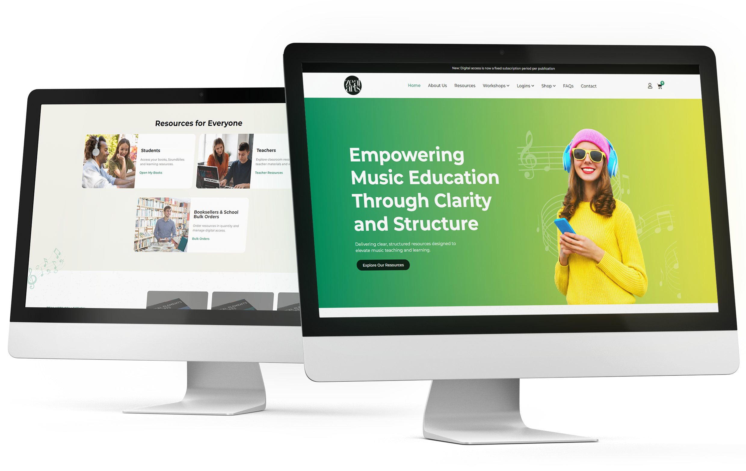
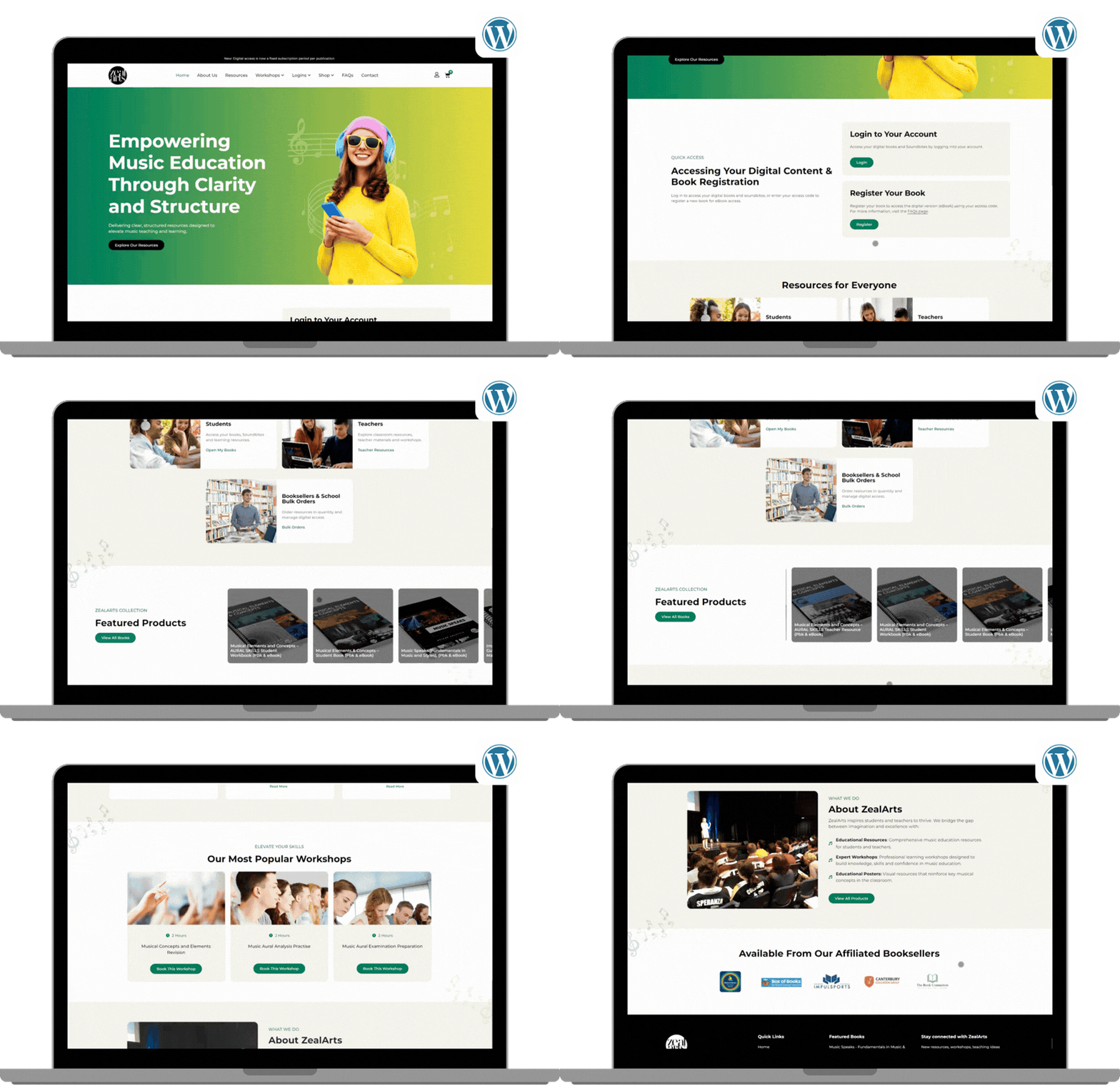
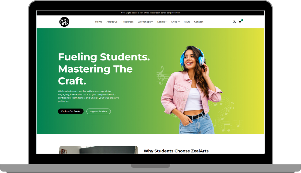
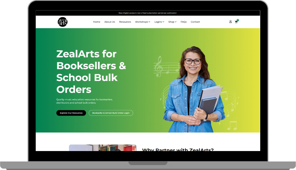
Established customized user access hubs and portal entry points tailored specifically to the workflow needs of teachers, students, and affiliated booksellers.

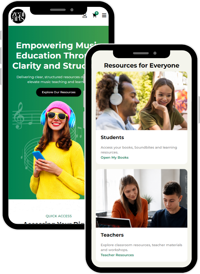
Built a fully responsive WordPress architecture ensuring seamless performance, readable typography, and fluid layout adjustments across all smartphone and tablet viewports.

Mobile Responsiveness

Before and After:

Before BokoAfter Boko
❌ Fragmented Visual Identity: A fragmented design with disparate elements and high-contrast, dark blocks that lacks professional cohesion.Streamlined Branding: A cohesive visual identity with clean white space and modern gradients, reflecting a unified and professional brand presence.
❌ User Friction and Clutter: Crowded layouts and non-intuitive interactions create a confusing and high-friction user experience (UX).Optimized UI/UX and Navigation: A clear visual hierarchy and an intuitive Mega Menu provide seamless access to diverse content for distinct user types.
❌ Lack of Audience Targeting: Undifferentiated sections fail to effectively speak to or direct teachers, students, and booksellers to their specific areas.Dedicated Persona Portals: Strategic implementation of dedicated pages and pathways for teachers, students, and booksellers, improving relevance.
❌ Static Desktop Layout: A static, desktop-oriented design that cannot adapt or scale effectively for the modern multi-device user.Fluid Mobile Responsiveness: A fully optimized, responsive design built on WordPress, ensuring a seamless experience across all mobile and tablet devices.
After Image
AFTER
Before Image
BEFORE

Results

The results section would ideally detail key metrics and positive outcomes achieved following the implementation of the new website. This section can include:

Improved User Engagement:

Increased Conversions/Sales:

Streamlined Workflows:

Enhanced Brand Perception:

Ready to transform your own digital presence with strategic WordPress solutions?

Let Boko’s expert design and development team create an impactful website that drives tangible business results and connects with your audience. Contact us today to discuss your project.